
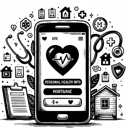
MORTGAGE PROTECTION
A Personal Health Info App
Background
During the pandemic, many companies and organizations had to quickly shift from services that required manual paperwork or in-person meetings to effective and engaging digital flows.
This app transformed the process of applying for mortgage protection from paper forms and insufficient digital forms that needed follow-up meetings or phone calls, to a seamless digital journey.
The users would be directed to this service by their mortgage broker and could do all the process simply and in their own time.
The Problem
The existing process was cumbersome, requiring users to engage in manual calls and meetings, leading to interruptions and delays.
Additionally, insufficient data collection and lack of engagement methods for users to provide detailed health information resulted in inaccurate estimations of mortgage protection costs, costing the organization significantly each year.

The Goal
The primary goal was to optimize the user journey and introduce a comprehensive set of medical history questions. This enhancement aimed to enable an AI engine to make automated, accurate decisions regarding insurance cover, pricing, and benefits.
Design Challenges
Streamlining The User Journey
From paper forms, in-person meetings follow-up calls, and delayed document submissions to an easy-to-use app
Eliminating The Pain Points
The biggest advantage for the user was removing the need to have manual calls with the insurer/advisor, interruptions and delays on their journey, and do everything automatically through one digital journey.
To tackle this, I examined the current app, manual processes, and new business requirements. User feedback from the old design was crucial in identifying pain points.

Hidden Challenges And Emotional Costs
A significant challenge was to ensure users, especially those with medical conditions, could complete the process without interruptions or perceived discrimination.
Especially for users who might have a few medical conditions. These users would normally experience interruptions, and delays, and even perceive prejudice and possible discrimination when coming across similar services where they have to meet or call staff members.
Research & Exploration
The user journey began with a referral from their mortgage broker, seamlessly integrating the new digital process into their existing path.
To ensure the journey was realistic and comprehensive, I organized a user testing group of individuals who had recently navigated the mortgage process, and getting mortgage protection was a relevant and natural next step for them.

Design Challenge:
Diverse Health Scenarios That Would Unfold In A Real-life Use Of The App
Our app needed to account for numerous health conditions and real-life scenarios. The variety of potential user flows, based on individual health conditions and their combinations, created an infinite number of possibilities that early prototypes couldn't cover.

Solution:
Focused Testing With Specific User Groups
To manage this complexity while ensuring realistic testing, I chose to focus on one chronic condition—diabetes. By recruiting users with diabetes, we could delve deeply into specific, tailored medical history questions. This approach allowed us to create and test prototypes that closely mirrored real-life scenarios, providing a rich and detailed testing experience.
Outcome:
By carefully selecting these user groups, and collecting feedback from financial advisors and stakeholders we were able to develop and refine prototypes that offered a seamless, accurate, and empathetic digital experience, ensuring the final design could scale to meet the needs of all users effectively.
Key User Testing Questions
Insights & Iterations
1. Journey Length:
Would the extended process and the longer user flow deter users from completing it?
2. Trust:
Would detailed questions enhance users' trust in the final outcome?
3. Content Preferences:
Did users prefer less information or detailed explanations?
Feedback was overwhelmingly positive. Users with advanced health conditions preferred answering detailed questions online over facing delays with manual processes. They appreciated the clarity and seamless experience, recognizing the value in a longer journey to save time and effort later.
Users also felt reassured by the detailed questioning, which increased their trust in the accuracy of the final quote. This insight countered the assumption that a quicker journey with fewer steps is always better.
Contrary to common design beliefs, users desired more information about the plan covers, prices, and benefits. Well-organized, easy-to-scan text reassured them, emphasizing that visual minimalism isn't always the optimal approach.
The Result
The redesigned app successfully transitioned users from manual, error-prone processes to a seamless, digital journey.
Users valued the clear, detailed questions and appreciated the transparency provided by the additional information. The fact that they didn't have to go through interruptions or call for further procedures, made them open and willing to go through a longer digital journey.
In addition, the new journey led to a higher level of trust in the outcome. Because users felt that because they have provided more information the app is making a more informed decision about their plan and pricing.
This elevated engagement in user experience was ultimately benefiting both users and the organization.
Design


