
ENHANCING MONETIZATION
User-Friendly Collapsible Ad Banners in Utility Apps
Background
Generating App Revenue while Maintaining a Seamless User Experience
The majority of apps on the Play Store are available for free or have a free version, which is where the majority of users are. To make revenue, publishers rely on in-app ads.
The company was aiming to pitch an ad format to app publishers on Play Store: Collapsible banners, a new ad format designed to offer increased exposure for advertisers without disrupting the user flow.

Collapsible Banners:
Collapsible banners slide up from the bottom of the screen during the user journey, covering a part of the interface. Users can collapse these banners into a smaller, less intrusive form, allowing them to continue using the app uninterrupted. This format aims to capture user attention more effectively than traditional banners, which are often ignored.
Challenge
Advertisers are constantly seeking ways to engage users more effectively, willing to pay a premium for ad formats that promise better visibility.
However, app publishers are cautious about implementing these formats due to concerns about negative impacts on user experience.
The primary challenge was determining the optimal placement and timing for these ads to ensure they did not hinder the user’s interaction with the app.

Goal
I was tasked with creating a design bank of examples and guidelines for incorporating collapsible banners into utility apps. The goal was to find a balance that benefits both advertisers and app publishers while maintaining a positive user experience.

Solution
To create effective solutions, I immersed myself in several utility apps, analyzing their task flows and overall user experiences.
Then, I formulated best practices for implementing collapsible banners:
1
User Familiarity:
Familiar Users: For users accustomed to the app, ads can slide up when opening the app or transitioning to a main screen. These users know the interface, how to navigate the app and can easily collapse the ad.
Unfamiliar Users: For new users, avoid displaying ads during app launch or transitions to unfamiliar screens to prevent confusion.
4
Post-Task Completion:
After completing a task, display the ad with a delay, allowing users to see the task's finality first. The screen should adjust so that the CTA remains visible above the ad.
2
Idle State:
Display ads after the user has been inactive on a screen for a while, ensuring their activity is not interrupted. This approach works well on main screens with long content or multiple actions.
3
Screens with One Main Call to Action:
When a screen has a single call to action, ensure the ad slides up in a way that the CTA remains visible above the ad field.
5
Task Completion with Top Actions:
For tasks that conclude with a main action at the top of the screen, the ad should slide up, keeping the CTA consistently visible above the ad.
7
Bottom Navigation or Control Bars
If the app has a navigation bar or controller at the bottom (like a music player), ensure the ad slides up above these elements, maintaining consistent access.
6
Waiting Times:
Display ads during waiting periods for tasks like file scanning or uploading, before transitioning to task completion.

Outcome & Impact

Animated
Mocks
As part of the design bank, I created a series of mocks both static and animated. They served different use cases based on where they were being pitched or presented.
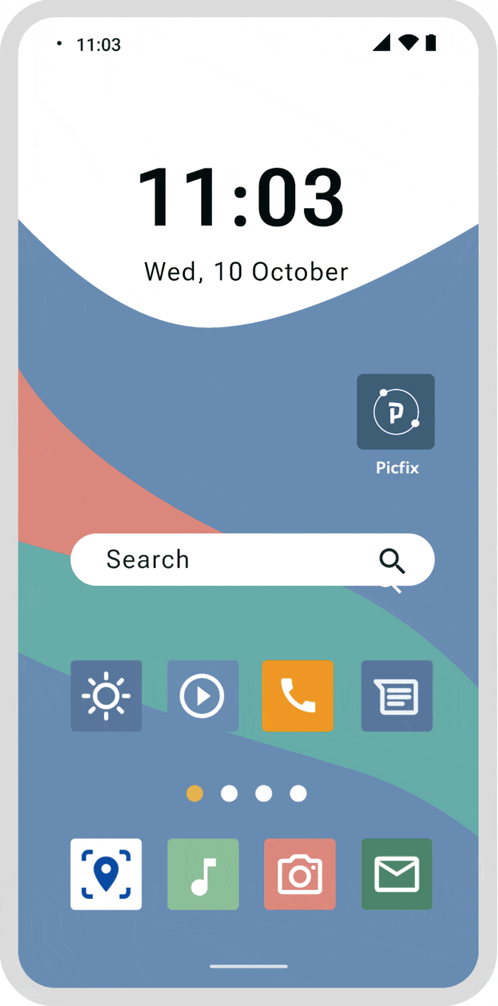
Sample Designs


